![]()
KROMA Cosmetics
Cosmetics, Editorial, Packaging
Project Summary
About
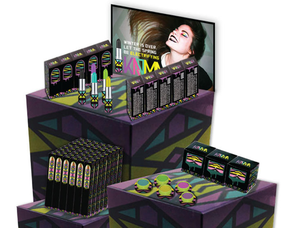
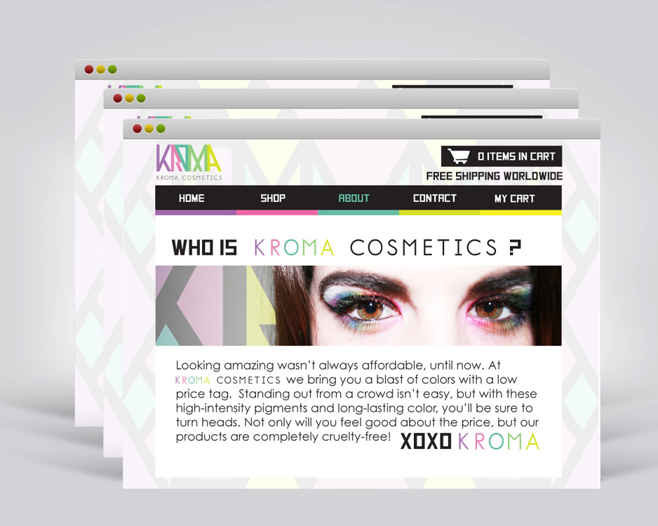
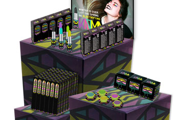
For us who love color, it just isn’t a cheap option. You can find neon lipsticks and eyeshadows, as well as dark pigments, online and in high-end retail, but never in your local drug store or walmart. At KROMA Cosmetics, a hypothetical brand, they would reach a lower price point, from ages 14-30. It will stand out on the shelves with its display and packaging, but will not burn a hole in an average consumers pocket.
Mission Statement
At KROMA Cosmetics, we want to be able to bring individuality to everyone at a low cost. With our long-lasting pigments, we want to create a product that will satisfy our customers with its uniqueness, and convenience.
Design Aesthetic
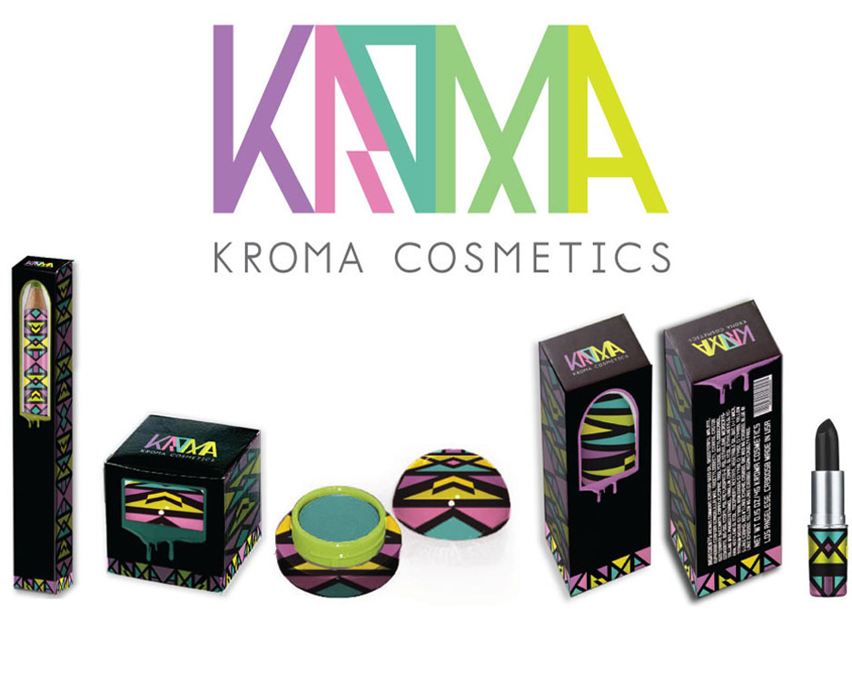
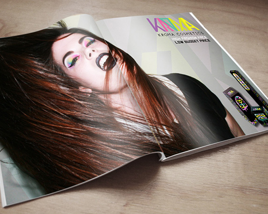
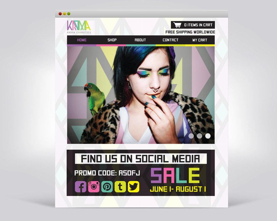
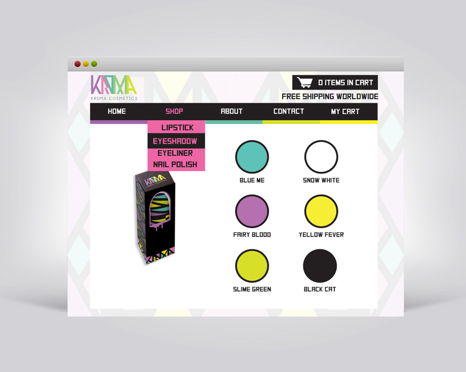
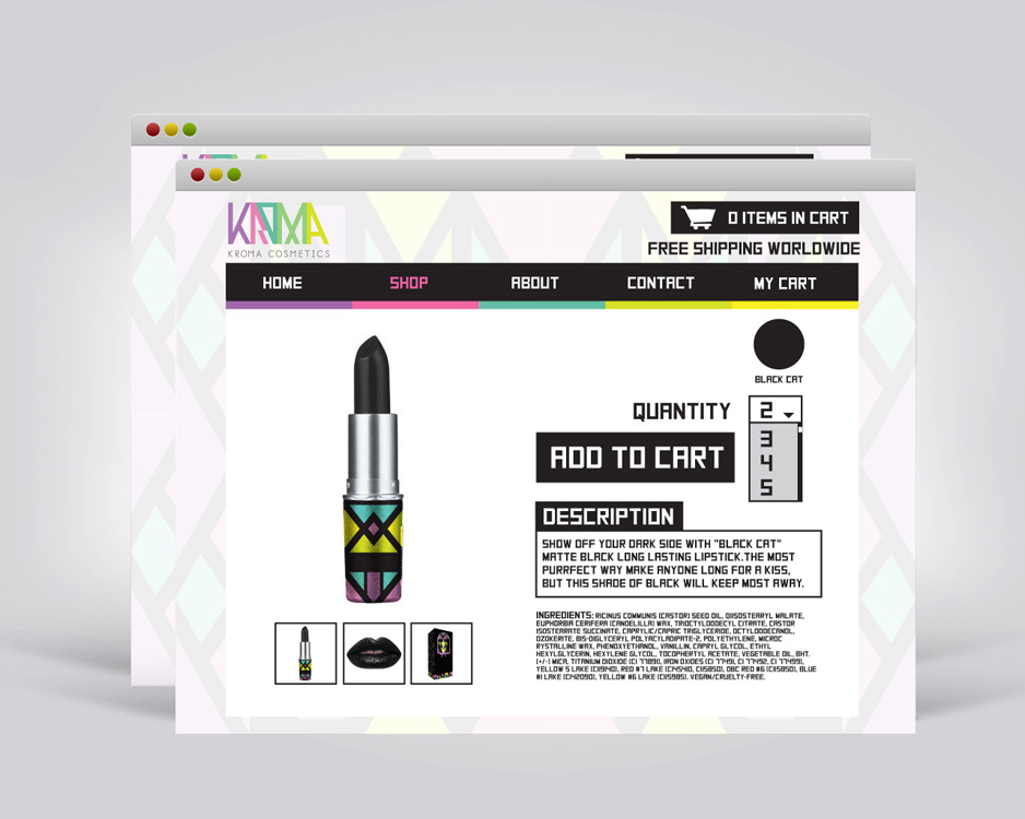
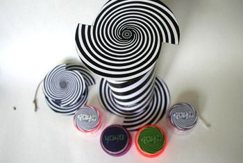
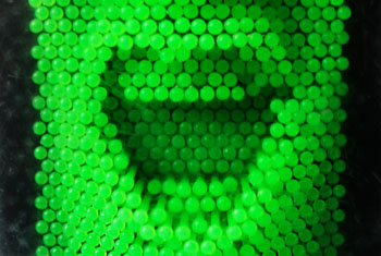
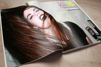
The KROMA design will reflect the colors represented in the first line. This will be a selections of neons and blacks, making this a clean, but bold design. The pattern on most of the packaging is a knockout and reflection of the logo, and will be repeated on the ads and displays.
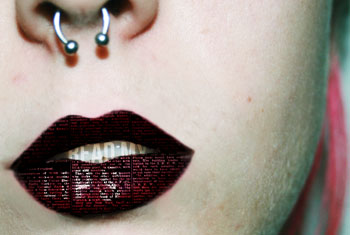
All of the photography, styling, and makeup were done by me for this project.
DESIGN ASPECTS
Logo Design
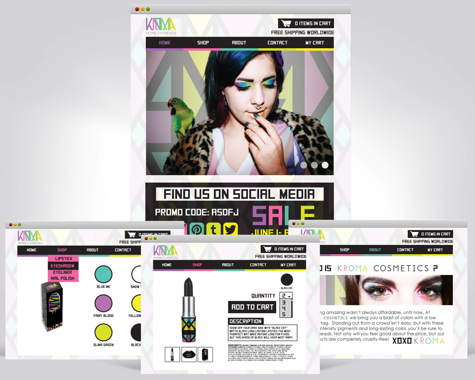
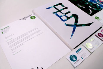
Corporate Branding & Identity
Styling & Cosmetics
Photography
